openEQUELLA 2018.2 Features Guide
Table of Contents
- openEQUELLA 2018.2 Features Overview
- Usage Counts
- Streamlined openEQUELLA Resource Attachments
- Course Selector
- HTTP Referrers
- Theme Editor
- Scripting API
- Docker
openEQUELLA 2018.2 Features Overview
This guide provides an overview of the features released in openEQUELLA 2018.2.
The following features are included:
- Views counts for summary pages and attachments - Views counts can now be displayed for summary pages and attachments. See Usage Counts.
- Streamlined process for attaching openEQUELLA resources during contribution - an option to remove a number of dialogs during the selection of EQUELLA resources during contribution has been added. See Streamlined openEQUELLA Resource Attachments.
- Course selector updated across openEQUELLA - the course selector has been updated to allow searching of Title, Code and Description with a scrollable list. See Course Selector.
- HTTP Referrers added to log - HTTP referrers are now captured in the audit log to enable identification of an item’s LMS usage. See HTTP Referrers.
- Theme Editor - a new Theme Editor is available to apply colour schemes to the new UI template and search page components and to upload logos. See Theme Editor.
- Scripting API - Navigation of Control and XML objects are now enhanced. See Scripting API.
- Docker - Enhanced runtime environment and a build environment are now available. See Docker.
Important note regarding facet configuration
In openEQUELLA 6.6, when enabling the new Search UI page prototype, a simple facet search editor enabled configuration of facet searches. Due to the further development of the new Search UI and the creation of APIs for facets, openEQUELLA 2018.2 no longer has the facet search editor available.
Additionally, if facets were configured in your openEQUELLA 6.6 Search UI, upgrading to openEQUELLA 2018.2 will result in those facets no longer displaying on the new Search UI page. However, facets can be re-configured or created using REST APIs. It is expected that a user-friendly Search UI Editor that will enable the configuration of default search pages including facets will be included in our next release.
Usage Counts
Suitably privileged users can view usage counts for both summary pages and attachments.
NOTE: Counts start accumulating once the system is upgraded to openEQUELLA 2018.2.
New ACL for Usage Counts
Users with the new ACL VIEW_VIEWCOUNT granted will be able to see the new view counts displayed for each item and attachment.
View Summary Page Views Counts
The Summary page Views count displays in the Details section of an item summary page for users with the new VIEW_VIEWCOUNT privilege granted. An example is shown in Figure 1.
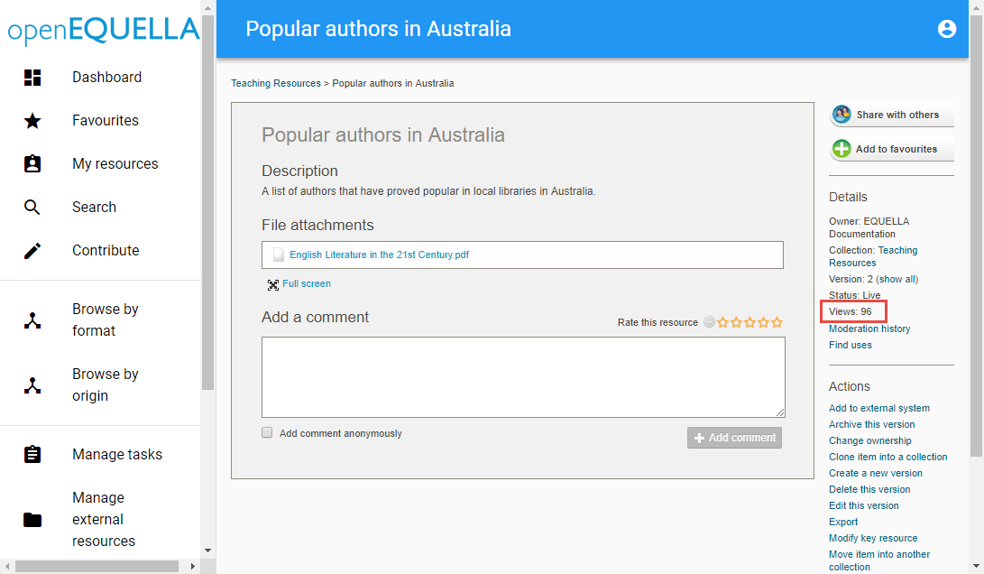
Figure 1 Summary Page View Count
The Views count shows the total number of views for the currently opened version of the item. The number of views for each version of an item can also be viewed.
To view the Views counts for all item versions
- Open the required item’s Summary page.
- Click the show all link in the Details section, next to the Version number. The Versions of this item page displays, showing the Views for each version. An example is shown in Figure 2.
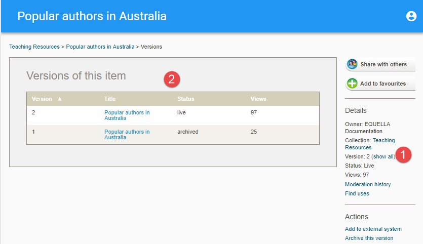
Figure 2 Versions of This Item - Views Count
View Attachment View Counts
Attachment view counts display in the attachment drop-down for each attachment for users with the new VIEW_VIEWCOUNT privilege granted. An example is shown in Figure 3.
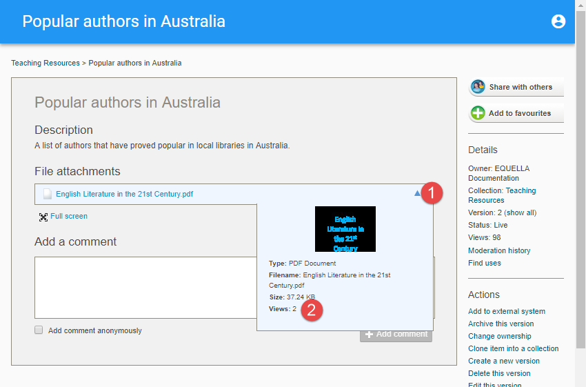
Figure 3 Attachment View Count
Smart vs Normal Logging
Logging type (SMART or NORMAL) can be set in the mandatory.properties file. Setting SMART logging allows usage counts to occur per session rather than each time a user opens a summary page or an attachment.
For example, if SMART logging is set, when a specific item summary page is opened multiple times by a user in one session, the count will only go up by 1. If NORMAL logging is set, the count will increase by one each time the user opens that item’s summary page during that session.
Streamlined openEQUELLA Resource Attachments
When selecting existing openEQUELLA resources as attachments for an item, an option has been added to reduce the number of pages that display during the process. Removing these pages provides a more streamlined experience for contributors.
Set Skip Checkout Page Option
A new option to Skip checkout page displays on the Attachments page in the Collection Definition Editor.
To set the ‘Skip checkout page’ option
- Open the Collection Definition Editor for the relevant collection from the Administration Console.
- From the Wizard tab, select the relevant File attachment wizard control. An example is shown in Figure 4.
- Make sure the openEQUELLA Resources attachment type is selected in the Allow the following attachment types: section.
- In the openEQUELLA Resources configuration section, select Skip checkout page.
- Select Save.
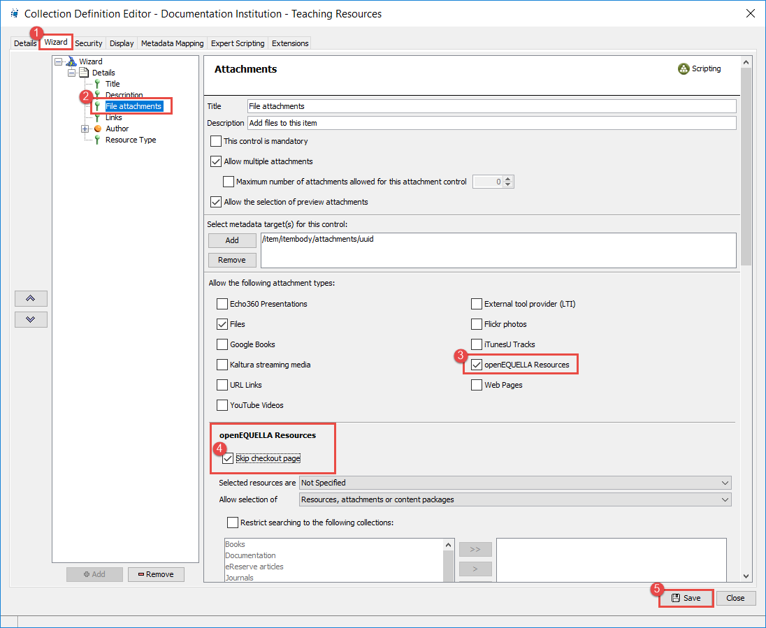
Figure 4 New openEQUELLA Resources Option on the Attachments Wizard Page
Attach openEQUELLA Resources With New Option Selected
Once this option has been saved, the checkout page no longer displays during the contribution process.
An example of the pages that display when selecting and returning openEQUELLA resources during contribution when the new option is selected are shown in Figure 5 and Figure 6.
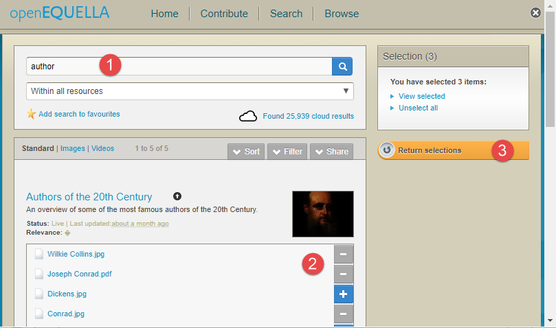
Figure 5 Resources Selected
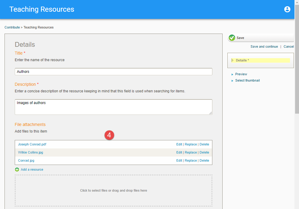
Figure 6 Contribution Wizard Page With Returned openEQUELLA Resources
If required, the Edit link beside each attachment can be used to make changes to the display name of the attachment.
Course Selector
The openEQUELLA Course Selector has been updated to be scrollable and searchable. Any search string entered will be matched with data stored in the Course Title, Description and Code fields. All instances of the Course Selector within openEQUELLA have been updated.
An example with the scroll bar displayed is shown in Figure 7.
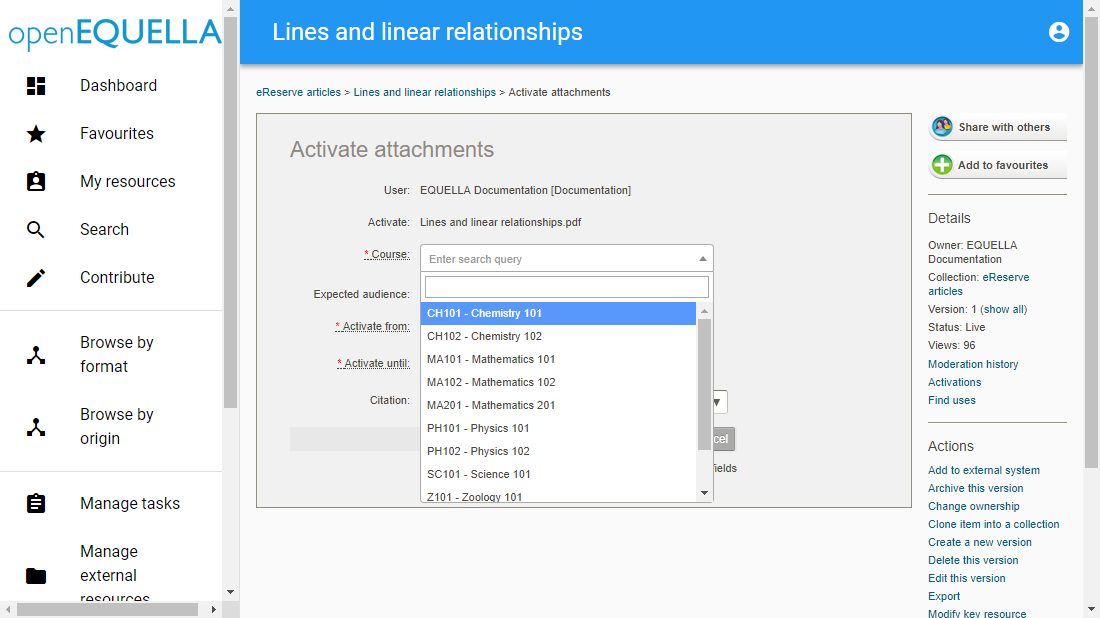
Figure 7 Course Selector With Scroll Bar
An example with search terms and results is shown in Figure 8.
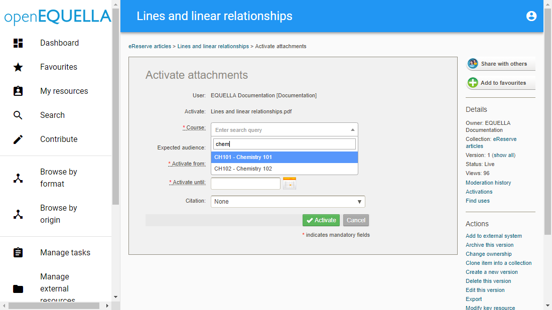
Figure 8 Course Selector With Search Terms and Results
HTTP Referrers
HTTP referrers have been added to the database audit log, which enables reporting and identification of the integrated LMS instances in which an item is being used.
Examples of a Postgres database with LMS HTTP referrers are shown in Figure 9 and Figure 10.
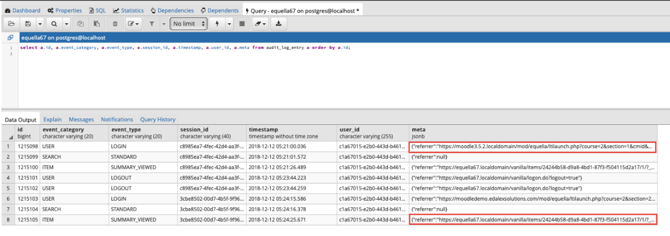
Figure 9 Postgres - HTTP Referrers for Integrated LMSs
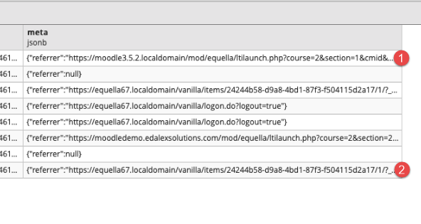
Figure 10 Postgres - HTTP referrers for Integrated LMSs - Magnified
Theme Editor
The new Theme Editor enables administration users to apply theming to the new openEQUELLA UI template, by selecting a colour scheme for page components and uploading a logo.
Accessing the Theme Editor
The Theme Editor is accessed from the UI category of the Settings page.
To Access the Theme Editor
From the UI category of the Settings page, select the Edit Theme Settings button. An example is shown in Figure 11.
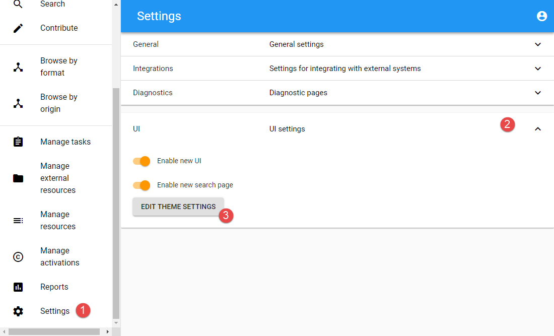
Figure 11 UI Settings - Edit Theme Settings
NOTE: At a minimum, the Enable new UI needs to be turned on to access the Theme Editor.
The Theme Settings page displays. An example is shown in Figure 12.
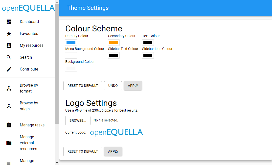
Figure 12 Theme Settings Page
Applying a Colour Scheme
Colours can be selected and applied to specific areas of pages. Colours can be set for seven separate components of the pages, however some of those components only display as part of the new Search UI page.
Colour Scheme settings
The Colour Scheme area includes seven components, and colours can be set for each. Once colours are selected, the Apply button is used to the refresh the page and apply the new colours.
The Undo button is used to undo the changes made within a configuration session (prior to the Apply button being used).
The Reset to default button is used to return to openEQUELLA default colours.
To Apply New Colours
- Click the colour panel of the page component to be changed (for example, Primary Colour). A colour selector displays, as shown in Figure 13.
- Select the required colour by entering the HEX or RGB codes, if known, or by clicking one of the solid colour squares at the bottom, which will change the colour palette. Select the required colour by clicking in the colour palette. An example is shown in Figure 14.
- Click the Apply button. The changes are applied to the relevant page component. An example is shown in Figure 15.
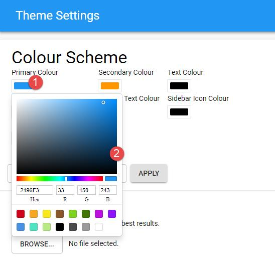
Figure 13 Colour Selector
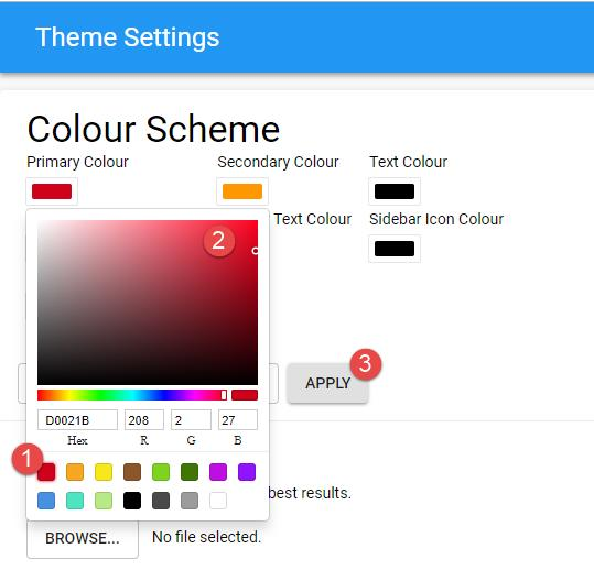
Figure 14 Colour Selector With Changed Palette
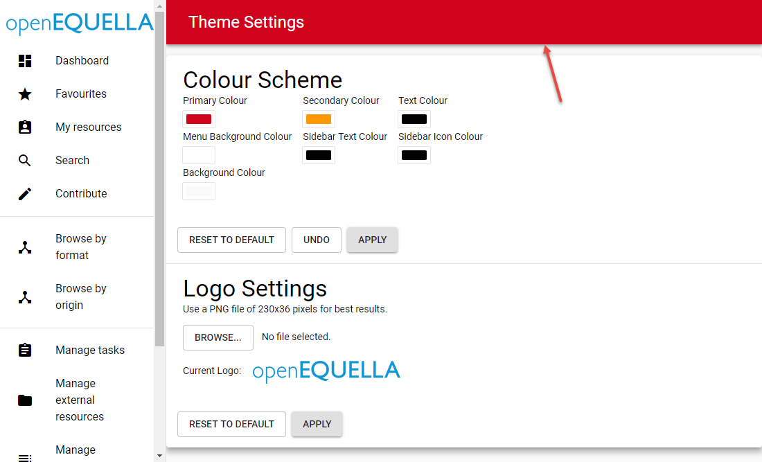
Figure 15 Primary Colour Change Applied
Colour Scheme Components
There are seven colour scheme components that can be changed:
Primary Colour
Changing the Primary Colour applies the new colour to the background of the main banner at the top of each page, and the Title text on the new Search page. An example is shown in Figure 16.
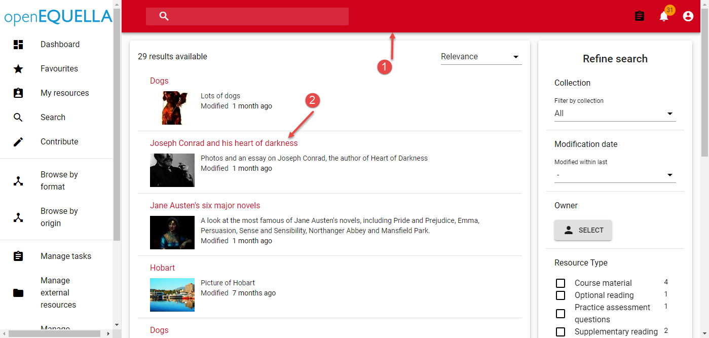
Figure 16 Primary Colour Change – New Search Page
Secondary Colour
Changing the Secondary Colour changes small control components such as the buttons to toggle functionality and the Add button on the Courses page. An example is shown in Figure 17.
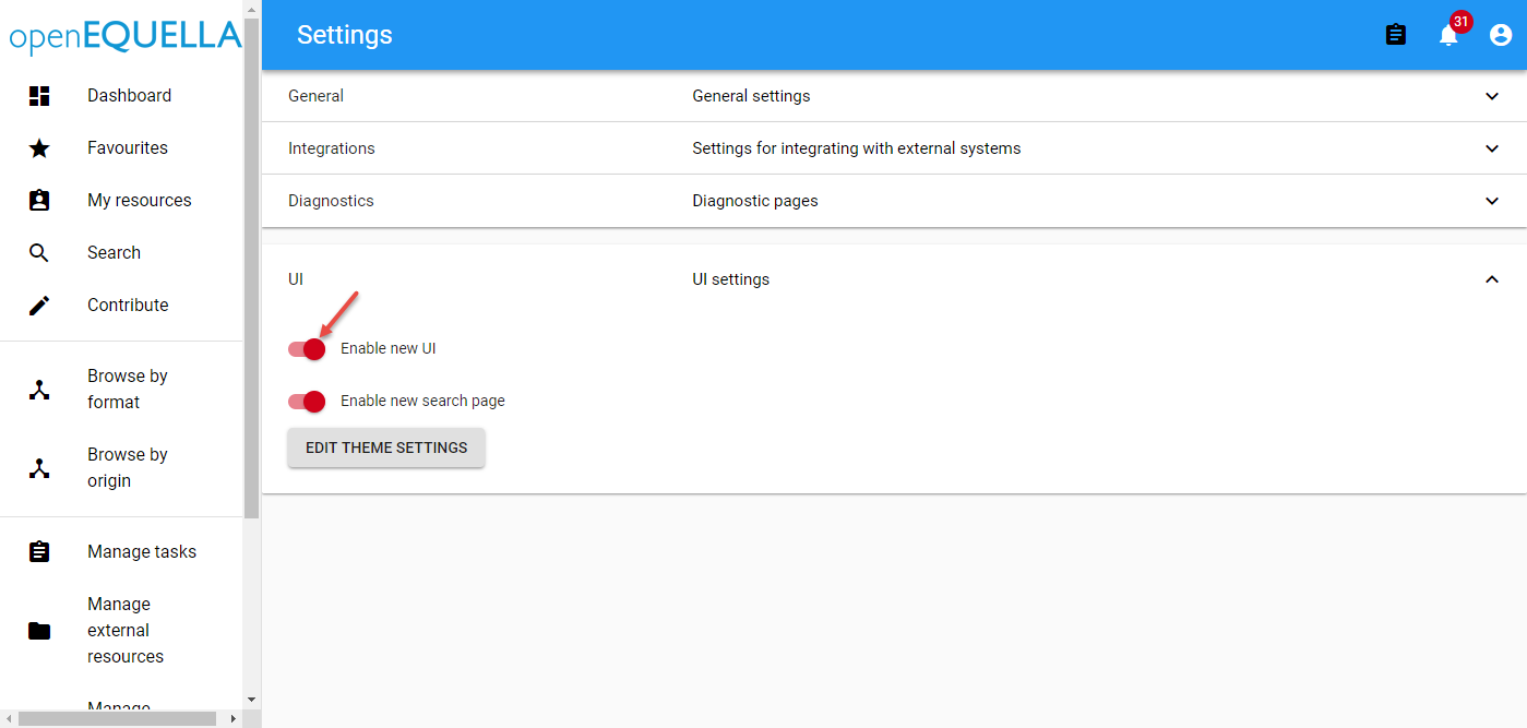
Figure 17 Secondary Colour Components
Text Colour
Changing the Text Colour changes some text. It does not affect text on the original search page. Examples are shown in Figure 18 and Figure 19.
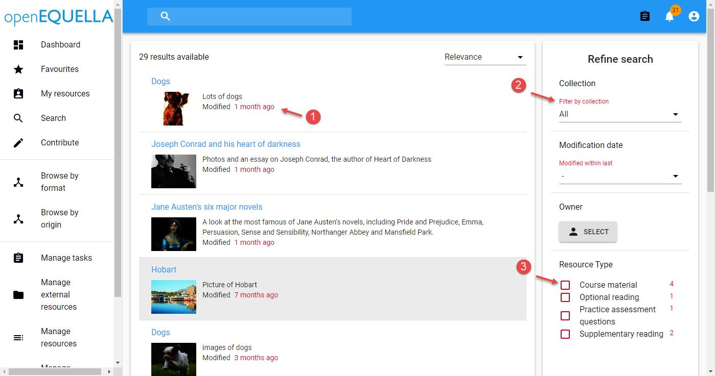
Figure 18 Text Colour Change - New Search Page
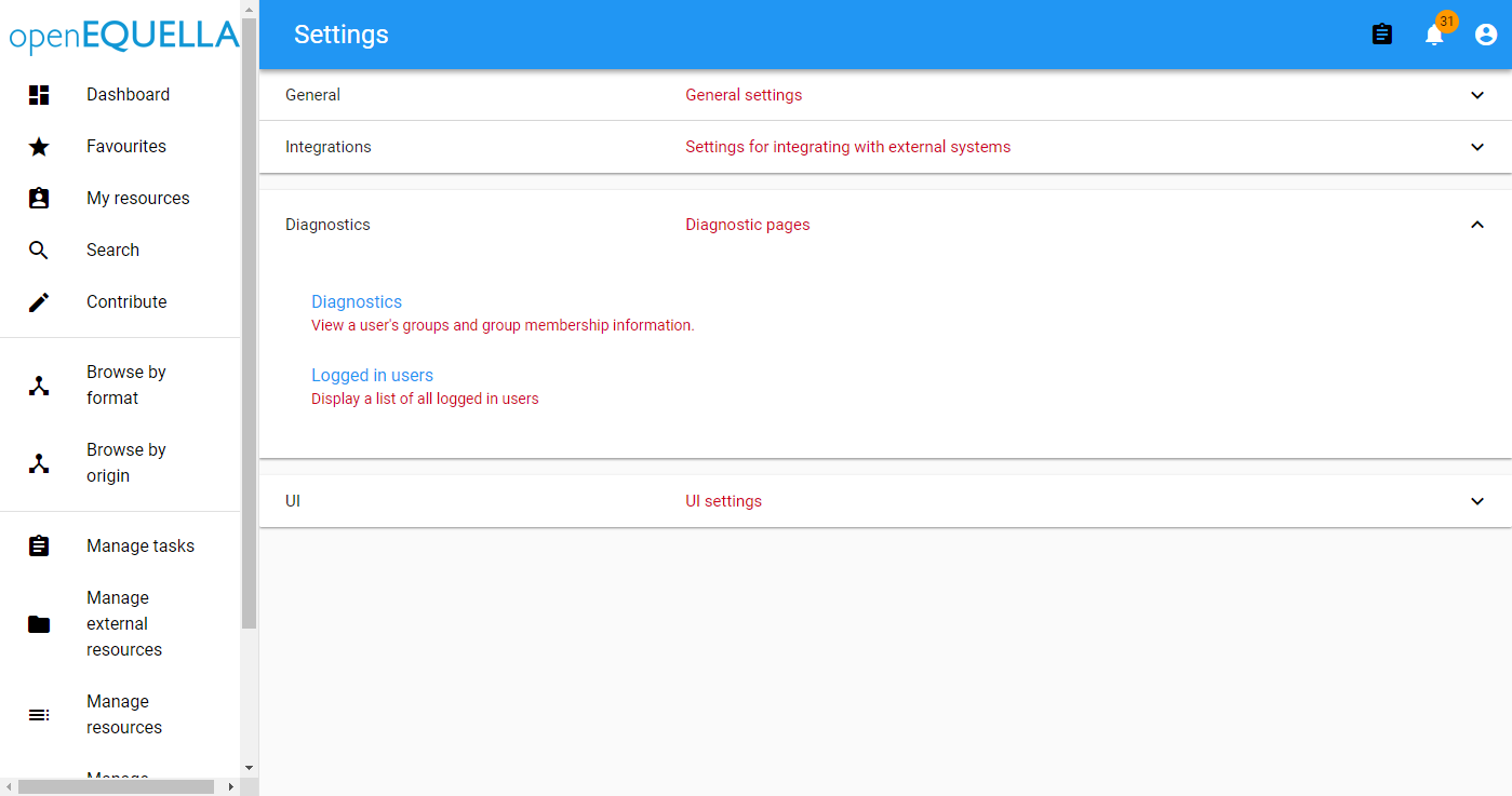
Figure 19 Text Colour Change - Settings Page
Menu Background Colour
Changing the Menu Background Colour changes the background of all menu panels, including the navigation menu, results panel and filter panel. An example is shown in Figure 20.
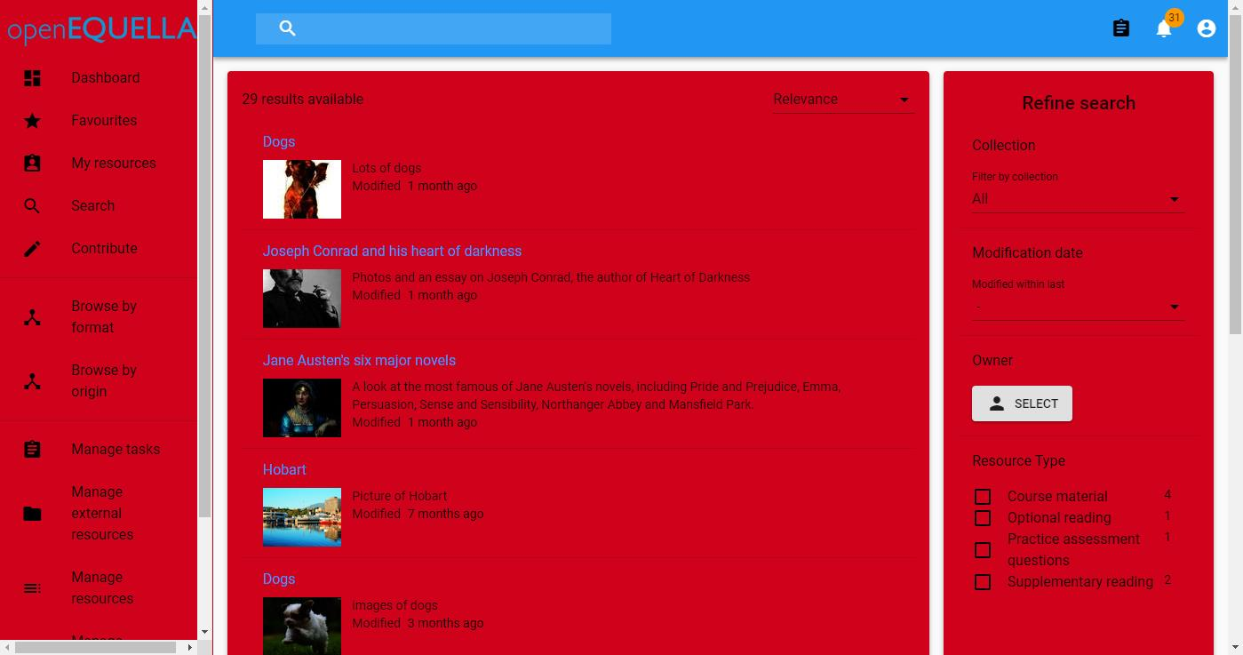
Figure 20 Menu Background Colour Change - New Search Page
Sidebar Text Colour
Changing the Sidebar Text Colour changes the text on the navigation menu, the filter panel and the number of results text at the top of the results panel. An example is shown in Figure 21.
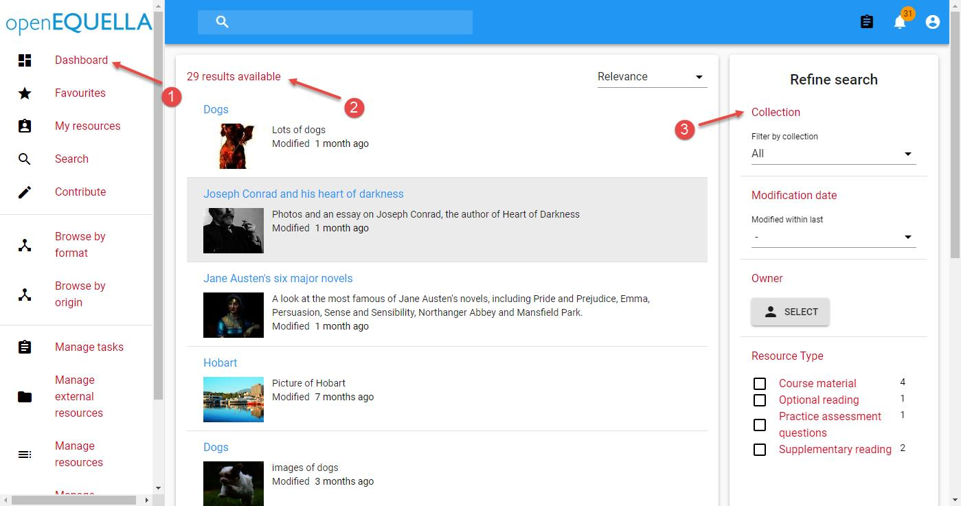
Figure 21 Sidebar Text Colour Change - New Search UI
Sidebar Icon Colour
Changing the Sidebar Icon Colour changes the colour of the icons on the navigation menu and some other places. An example is shown in Figure 22.
![]()
Figure 22 Sidebar Icon Colour Change - New Search UI
Background Colour
Changing the Background Colour changes the background colour of all pages. An example is shown in Figure 23.
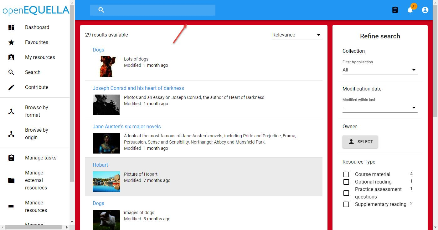
Figure 23 Background Colour Change - New Search UI
Logo Settings
The Logo Settings area allows an alternative logo to be uploaded and displayed in the top left hand corner of the screen.
NOTE: For the best results, the logo png size should be 230x36 pixels. Logos of alternative sizes will be adjusted to these dimensions.
To Upload a New logo
- From the Logo Settings area of the Theme Settings page, click the Browse button to select and open the required file.
- Click Apply. An example is shown in Figure 24.
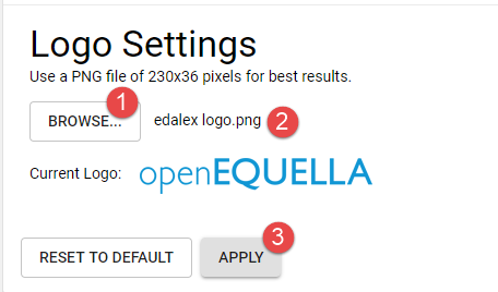
Figure 24 Logo Settings
The new logo displays. An example is shown in Figure 25.
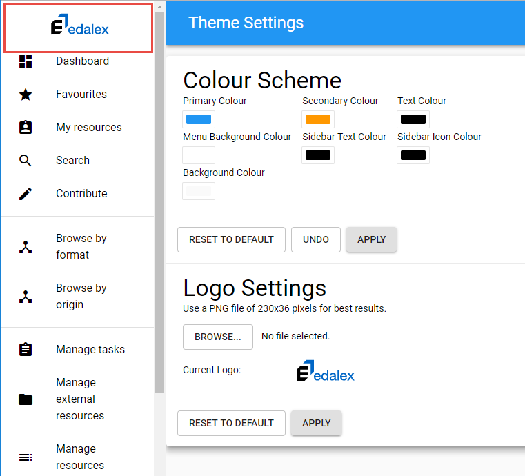
Figure 25 Uploaded Logo Displayed
Click Reset to default to return to the original logo.
Scripting API
Scripting API SBT Task
You can now build the ‘Scripting API’ documentation from the current codebase.
From a clone of the Equella repository, run sbt writeScriptingJavadoc. The javadoc API will be placed in Equella/target .
New XMLScriptType API Methods
New methods were added to the XML script object to allow ease of traversing the XML tree:
- XmlScriptType getParent()
- List
getChildren() - String getName()
A code example of using these API calls can be found in PR #545.
New ControlScriptObject Methods
New methods were added to the Control script object to allow ease of navigating controls in repeaters / groups:
- ControlScriptObject getParent();
- int getIndex(ControlScriptObject child);
A code example of using these API calls can be found in the issue thread for #475.
Docker
Docker abilities were enhanced to allow a more consistent environment for building Production worthy installers / upgraders, and to provide a consistent runtime environment. Please see the /docker folder’s README for the Docker openEQUELLA runtime environment and build environment.